Fredoka One Font: Download, History & Best Uses
Fredoka One font is bold, bubbly, and memorable. Learn its history, license, best uses, pairings, and modern alternatives.
Fredoka One is a rounded, heavy sans-serif display typeface originally designed by Milena Brandão. The original single-weight Fredoka One was later replaced in the Google Fonts catalog by the expanded Fredoka family, which offers variable width and weight controls.
What is the Fredoka One font?
There is something immediately cheerful about Fredoka One font. Its thick strokes, generous curves, rounded terminals, and almost inflated letterforms give ordinary words a soft, friendly personality.
The typeface was designed by Milena Brandão and originally entered Google Fonts as a single-weight display face in 2012. In 2021, Google Fonts replaced the original Fredoka One with an expanded variable version simply called Fredoka, developed with Hafontia and led by Ben Nathan.
That distinction matters if you’re looking for a download today. Searching for “Fredoka One” can lead you to older files and specimens, while the current Google Fonts family is Fredoka.
Fredoka One was originally a single-weight display font; today’s Fredoka family expands it into a variable typeface.
The result is more than a name change. The modern family gives designers considerably more control over weight and width while retaining the recognizable rounded character that made Fredoka One popular.
Fredoka One vs. Fredoka: what’s the difference?
The easiest way to understand the relationship is to think of Fredoka One as the original character and Fredoka as its expanded toolkit.
The original Fredoka One was essentially a single, bold display style. The current Fredoka family contains five named weights, Light, Regular, Medium, SemiBold, and Bold, and is also available as a variable font with weight and width axes. Google Fonts’ own source records specify a weight range of 300–700 and a width range of 75–125.
| Feature | Fredoka One | Current Fredoka |
| Original release | 2012 | 2021 expanded version |
| Basic character | Rounded, bold, playful | Rounded, bold, playful |
| Weight choices | Single original style | 300–700 |
| Width control | No | Variable width axis |
| Variable font | No | Yes |
| Google Fonts status | Replaced | Current family |
| Designer lineage | Milena Brandão | Milena Brandão, Hafontia |
| Hebrew support | Not part of the original | Added in the expanded project |
This is why simply saying “Fredoka One is still on Google Fonts” is misleading. The original family was delisted, while the newer Fredoka family took its place.
If you’re recreating an older logo or graphic, however, the distinction becomes especially important: a modern Fredoka weight may look close without being an exact visual match to the historical Fredoka One file.
What does Fredoka One font look like?
Fredoka’s personality comes from its geometry rather than decorative flourishes. Letters are broad and rounded, strokes are visually substantial, and corners tend to feel softened rather than sharp.
That combination makes it feel more approachable than a conventional geometric sans-serif. A heading such as “Fresh Ideas” looks less corporate in Fredoka than it would in a strict geometric face.
The effect is particularly strong in large type. At display sizes, the rounded shapes become part of the visual identity rather than merely carrying information.
The visual characteristics that define it
Several traits explain the font’s distinctive appearance:
- Rounded terminals: Stroke endings feel soft instead of mechanical.
- Heavy forms: The original style has considerable visual weight.
- Friendly geometry: Circular and curved forms dominate the design.
- Display presence: Large text is where the personality becomes most obvious.
- Simple structure: Despite its playful appearance, it remains a sans-serif rather than a decorative script.
The important design lesson is that “playful” does not automatically mean “handwritten.” Fredoka achieves warmth through controlled geometry, which is why it can work for everything from children’s products to modern interfaces.
Is Fredoka One free for commercial use?
The Fredoka project is distributed under the SIL Open Font License 1.1 (OFL). The current Fredoka files in Google Fonts are identified as OFL-licensed, and the project’s source repository contains the associated license information.
That makes Fredoka suitable for many commercial applications, including branding, websites, packaging, documents, and applications, provided you follow the OFL’s terms.
There is one important distinction: free to use does not mean free of all licensing conditions. The OFL governs what you can do with the font software, including redistribution and modification, and has specific rules around selling the font software by itself and naming modified versions.
For a business project, the safest approach is simple: obtain the font from a reputable source, keep the included license information, and review the current OFL terms if you’re redistributing or modifying the files.
Fredoka is released under the SIL Open Font License 1.1, making it an open-source typeface rather than a proprietary commercial font.
Where can you get Fredoka One font?
If your goal is to use the typeface for a new project, the best starting point is the current Fredoka family rather than an unofficial “Fredoka One” download.
Google’s current source files identify Fredoka as the successor to the original Fredoka One. The Google Fonts repository also documents the transition and links to the project’s upstream source.
If you specifically need the historical Fredoka One file, for example, to reproduce an older design, verify that the particular file corresponds to the original release and retain its license information rather than assuming every website offering a “Fredoka One download” is distributing the same file.
That’s an easy mistake to make because many font-directory pages continue to list the old name even though the Google Fonts catalog now uses Fredoka.
How to use Fredoka in a design
Fredoka works best when its personality has room to breathe.
Use it for a headline, logo concept, poster title, product label, button, or short promotional message, and its rounded forms become an asset. Use the same heavy style for several paragraphs of dense text, and that personality can quickly become visual fatigue.
A good rule is to treat Fredoka as the voice of a design rather than the entire conversation.
For branding and logos
Fredoka is especially useful when a brand needs to feel friendly, youthful, accessible, or informal.
Think children’s products, casual food brands, community projects, games, educational services, lifestyle products, or cheerful technology. It can also work for a deliberately nostalgic identity where polished geometry is preferable to a handwritten aesthetic.
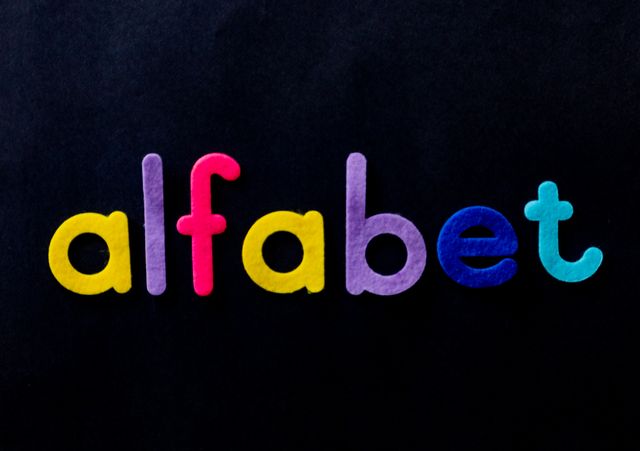
For a logo, test the actual wordmark rather than relying on a generic alphabet specimen. Rounded typefaces can behave very differently depending on the letters involved.
For websites and apps
The current Fredoka family is much more flexible than the original Fredoka One because designers can choose among multiple weights and widths. That makes it easier to create hierarchy without introducing another typeface.
A practical system might use a heavier Fredoka style for major headings, a medium weight for buttons or short labels, and a quieter companion typeface for longer text.
The trick is restraint. Fredoka’s distinctive shape should signal important elements rather than compete with every sentence on the screen.
For posters and social graphics
This is where the original Fredoka One personality really shines.
Large words such as “SALE,” “PLAY,” “HELLO,” or “NEW” can become almost graphic objects. The thick, rounded forms also hold up well when text is viewed quickly, which is useful for posters, thumbnails, event graphics, and packaging.
What fonts pair well with Fredoka?
Fredoka’s biggest strength, its personality, is also the thing that makes pairing important. Put it beside another highly expressive display font and the result can become noisy.
For most projects, pair it with something calmer.
Fredoka + Open Sans
Open Sans provides a practical contrast: Fredoka supplies character while Open Sans handles supporting information. This is a particularly sensible combination for websites, apps, educational material, and product pages.
Fredoka + Nunito
Nunito keeps the rounded, approachable mood but is generally quieter. The pairing works when you want a consistent friendly atmosphere rather than a dramatic contrast.
It’s a natural option for children’s products, community brands, wellness interfaces, and casual digital products.
Fredoka + Lato
Lato introduces a more restrained professional character without feeling excessively formal. It can help a playful headline coexist with more conventional business information.
This is useful when a brand wants warmth without looking exclusively child-oriented.
Fredoka + a serif
A serif can create a more editorial contrast. Something like Merriweather gives the rounded display face a more established, literary counterpoint.
This approach is particularly effective when the design needs both personality and credibility rather than pure playfulness.
What are the best alternatives to Fredoka One?
The right alternative depends on why you like Fredoka One.
If you want rounded geometry, consider Comfortaa or Quicksand. If you want a more expressive, chunky personality, Baloo 2 is worth testing. If you want something more restrained and professional, Poppins can preserve some geometric friendliness without copying Fredoka’s exaggerated roundness.
| If you want… | Try… | Why |
| Similar playful roundness | Baloo 2 | More expressive and characterful |
| Softer minimalism | Quicksand | Lighter, airier personality |
| Strong geometric structure | Poppins | Cleaner and more restrained |
| Fully rounded forms | Comfortaa | Very soft geometric appearance |
| Subtle friendliness | Varela Round | Less visually dominant |
But an alternative should not be chosen merely because the letters look vaguely similar.
Ask what you are actually trying to preserve: roundness, weight, friendliness, width, readability, or brand personality. Once you identify that characteristic, finding a substitute becomes much easier.
What are the limitations of Fredoka One?
The same boldness that makes Fredoka memorable can make it unsuitable for long-form reading.
Large headings are forgiving because readers recognize individual words quickly. Continuous paragraphs are different: the eye needs an easy rhythm across many lines, and a heavy display face can make that rhythm feel crowded.
Fredoka can therefore be excellent for a heading and poor for a 1,500-word article.
There’s another consideration: localization. The modern Fredoka family includes Latin, Latin Extended, and Hebrew support, but you should still test the exact languages your project requires before committing to a complete type system.
How should you choose the right Fredoka weight?
The modern family gives you a choice the original Fredoka One did not.
For a large headline, SemiBold or Bold can provide the visual punch people associate with Fredoka One. Regular or Medium can be useful when you want the same rounded identity with less visual mass.
Light and Regular weights can also change the personality considerably. Instead of assuming “Fredoka means bold,” treat the weight as a design control.
A useful starting framework is:
- Bold: major headlines, posters, short labels
- SemiBold: subheadings and prominent interface elements
- Medium: secondary headings and navigation
- Regular: supporting text where Fredoka’s personality is desired
- Light: delicate display applications and contrast
The exact choice should always be judged at the final size, because a font that looks balanced at 60 pixels may feel entirely different at 18 pixels.
Frequently asked questions
Is Fredoka One still on Google Fonts?
No. The original single-weight Fredoka One was removed from the Google Fonts catalog and replaced by the expanded Fredoka family.
Who designed Fredoka One?
The original Fredoka One was designed by Milena Brandão. The later Fredoka project was expanded with work by Hafontia and Ben Nathan.
Is Fredoka free for commercial projects?
Yes, the current Fredoka family is distributed under the SIL Open Font License 1.1. Always follow the license terms for redistribution or modification.
What is Fredoka best used for?
It is particularly effective for headlines, branding, posters, packaging, children’s products, interfaces, and other designs where friendliness and personality matter more than formal restraint.
What is the closest replacement for Fredoka One?
The current Fredoka family is the obvious first choice because it evolved directly from the original project. For different personalities, Baloo 2, Quicksand, Comfortaa, and Poppins are useful alternatives to test.
Key Takeaways
- Fredoka One font is the original single-weight version of the rounded Fredoka typeface.
- The original Fredoka One was designed by Milena Brandão and added to Google Fonts in 2012.
- Google Fonts later replaced it with the more flexible Fredoka family.
- Current Fredoka offers five named weights from 300 to 700, plus variable width and weight controls.
- The family is licensed under the SIL Open Font License 1.1.
- Fredoka works particularly well for headlines, branding, packaging, posters, apps, and playful interfaces.
- For body copy, pairing Fredoka with a calmer typeface usually creates better hierarchy and readability.
Additional Resources
- Fredoka: The current official specimen lets you preview Fredoka, test text, and work with the modern family rather than an outdated Fredoka One listing.