How to Identify a Font: A Practical Guide
How to identify a font from an image, screenshot, or logo, and finally find the right typeface without guesswork.
The easiest way to identify a font is to upload a clear image of the lettering to an AI font identifier such as FindFont.ai. For the best result, crop tightly around one line of text, keep the letters horizontal and sharp, then compare the suggested match against distinctive letterforms before using it.
You know the moment: you spot a headline, logo, poster, or Instagram graphic with exactly the right typography, and suddenly the font name becomes the only thing you can think about.
The frustrating part is that fonts can look remarkably similar. A small difference in the shape of a lowercase a, the curve of an R, the height of an x, or the spacing between letters can separate one typeface from another.
Fortunately, you no longer need to scroll through thousands of font previews hoping something looks familiar. If you have an image of the lettering, an AI-powered font finder can turn that visual clue into a shortlist of likely matches in seconds.
But there is an important distinction: identifying a font is not always the same as identifying the original typeface. A logo may use custom lettering, a designer may have modified individual characters, or the image itself may be too distorted for an exact match.
That is why the smartest approach combines visual recognition with a little typography detective work.
How to Identify a Font From an Image
When the font exists only as pixels in a screenshot, photograph, logo, poster, or social graphic, image-based identification is usually the quickest starting point.
FindFont.ai is designed specifically for this workflow. Upload a PNG, JPG, or WebP containing readable lettering, and its AI analyzes the visual characteristics of the text to return likely font matches.
1. Start with the clearest image you can find
The quality of your input matters more than most people realize.
A sharp screenshot is usually easier to analyze than a photograph because the letters have not been affected by camera movement, perspective, shadows, or uneven lighting. If the original design is available, use that rather than a screenshot of a screenshot.
For a photograph, try to capture the lettering straight-on. Avoid glare, extreme angles, motion blur, and heavy compression.
Better input produces better evidence.
2. Crop around one line of text
Don’t upload an entire poster when you only want to identify its headline.
Crop tightly around a single word or line using the same font, preferably one with several different characters. This prevents unrelated artwork, other typefaces, photographs, and decorative elements from interfering with the analysis.
For example, if a restaurant poster contains a script logo, a bold headline, and tiny body copy, analyze each style separately rather than throwing the entire poster into one identification attempt.
3. Upload the sample to FindFont.ai
Go to FindFont.ai and upload your image.
The tool is built around image-based font discovery, so you don’t need to know the font’s name beforehand. It analyzes the visible typography and provides likely matches rather than forcing you to browse a huge library manually.
This is particularly useful when your starting point is a:
- Website screenshot
- Logo
- Poster
- Packaging design
- Social media graphic
- Advertisement
- Presentation
- Photograph of printed text
4. Compare the result instead of blindly accepting it
A font identifier gives you a starting point, not necessarily courtroom-level proof.
Look closely at distinctive characters in the original and suggested font. Pay particular attention to lowercase a, g, e, f, uppercase R, Q, G, numerals, punctuation, and the shape of terminals.
If several letters line up beautifully but one unmistakable character is wrong, you may be looking at a similar typeface rather than the original.
A font match is strongest when several distinctive glyphs agree, not when the overall style merely feels similar.
How Font Identification Actually Works
Understanding what is being compared makes it easier to judge the results.
A font isn’t simply a visual “style.” It is a system of designed characters, or glyphs, with specific proportions, curves, strokes, counters, terminals, and spacing.
An image-based identifier essentially works backward from those visible characteristics.
Letterforms are the fingerprints
Consider two sans-serif fonts that both appear modern and clean. At first glance, they might seem interchangeable.
Now compare their lowercase g. One may use a single-storey form while the other uses a double-storey form. Their t, e, a, or numeral 1 may also have distinctive construction.
Those tiny differences provide valuable identification clues.
Look at typography beyond the font name
Experts don’t identify typefaces from personality alone. They examine measurable visual traits such as:
- Serif or sans-serif construction
- Stroke contrast
- X-height
- Width and proportions
- Letter terminals
- Bowl shapes
- Counter shapes
- Apertures
- Character spacing
- Stroke endings
- Numeral design
- Italic construction
Identifont, for example, uses questions about features such as serifs and individual character characteristics to narrow down typefaces.
This explains why a good font finder can be so effective: the task is ultimately about comparing shapes.
How to Identify a Font Without an Image Tool
Sometimes you don’t have a usable image. You may only have a vague memory of the lettering or be looking directly at a printed sample.
In that situation, manual classification can narrow the field.
First: decide whether it has serifs
Serifs are the small finishing strokes found on many traditional typefaces.
If the letters have them, you’re broadly looking at a serif typeface. If they don’t, you’re likely dealing with a sans-serif.
This doesn’t identify the font by itself, but it immediately removes a huge number of possibilities.
Next: examine the personality of the letters
Ask yourself:
Is it geometric?
Look for circles, clean construction, and relatively uniform forms.
Is it humanist?
Look for more organic proportions and subtle variation in stroke shapes.
Is it condensed?
The letters appear noticeably narrow relative to their height.
Is it monospaced?
Characters occupy equal horizontal widths, common in coding and technical interfaces.
Is it script or handwriting?
Letters may connect or imitate handwritten movement.
Is it display typography?
The design may be intentionally distinctive and better suited to headlines than paragraphs.
These descriptions won’t necessarily reveal the exact family, but they make your next search much more focused.
The Most Important Clues to Compare
When two candidates look almost identical, stop judging the overall “vibe.” Zoom in.
Compare the lowercase “a”
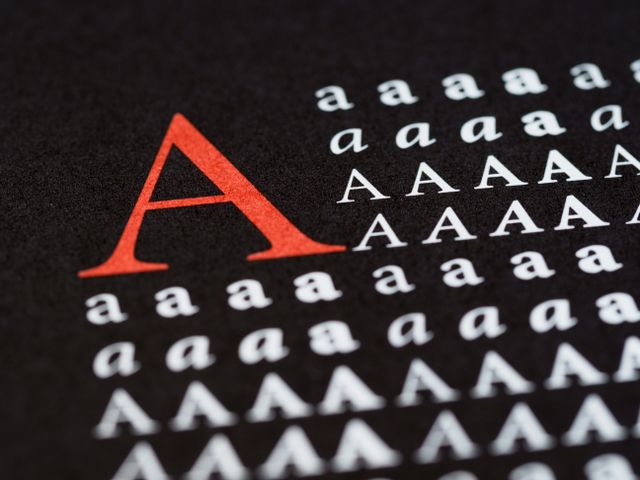
The a is one of typography’s most useful clues.
A single-storey a looks like a handwritten circle with a stem, while a double-storey a has a more complex upper and lower structure. That single distinction can eliminate many candidates immediately.
Compare the lowercase “g”
The g can be equally revealing.
Some typefaces use a single-storey form; others use a double-storey design. Even among fonts with the same basic construction, the proportions and lower loop can differ dramatically.
Check the “R”
Look at the leg of an uppercase R.
Is it straight, curved, dramatic, compact, or unusually angled? Does the bowl transition smoothly into the leg? These details can distinguish otherwise similar typefaces.
Don’t forget numbers
If your sample contains numbers, examine them.
The design of 1, 2, 4, 6, 7, and 9 can be surprisingly distinctive. This becomes especially useful when you’re identifying a font used in dashboards, packaging, sports graphics, prices, or advertisements.
Which Font Identification Method Should You Use?
The right method depends on what you actually have.
| What you have | Best approach | Why |
| Screenshot | Image-based font finder | Text is sharp and easy to analyze |
| Logo | Image identification + manual verification | Logos may contain modified lettering |
| Photograph | Image finder with a clean crop | Camera distortion can be reduced |
| Live webpage | Inspect the actual text/style | Source information can be more reliable than visual matching |
| Editable design file | Check the document’s font information | The original font may be directly available |
| PDF with selectable text | Inspect document font information | Embedded font data may reveal the family |
| Printed sample | Scan or photograph it | Creates an image that can be analyzed |
| Only a visual description | Manual typography classification | There is no actual glyph data to compare |
The key principle is simple: use the original source whenever possible.
If you can inspect the actual font information in a design file or live webpage, that is stronger evidence than guessing from pixels.
How to Identify a Font on a Website
A website presents a special case because the text may be actual HTML rather than an image.
If you can select the text, you’re dealing with live typography. A browser’s developer tools can reveal the CSS rules applied to that element, including the font-family declaration.
For example, a stylesheet may specify a family and then provide fallback fonts if the preferred font cannot load. Google Fonts’ documentation recommends specifying fallback families alongside the primary web font.
That makes source inspection preferable to visual identification when you have access to the page.
But what if you only have a screenshot? That’s exactly where image-based identification becomes useful.
How to Identify a Font in a Logo
Logos deserve extra caution.
A logo that looks like a particular font may not actually be typeset in that font. A designer might start with an existing typeface and then manually alter the letters.
They might stretch the wordmark, adjust kerning, redraw one character, modify terminals, or combine multiple letterforms.
That means an AI tool may correctly identify the closest underlying typeface while still failing to reproduce the logo perfectly.
If one or two letters refuse to match, the problem may be the artwork, not the font finder.
This is especially important with established brand marks and custom wordmarks.
Why Font Identification Sometimes Gets the Answer Wrong
Even strong visual matching has limits.
Low-resolution images
When the edges of letters are only a handful of pixels wide, subtle features disappear. A curved terminal can become a jagged edge, making two different fonts appear identical.
Perspective and distortion
A photograph taken at an angle changes the apparent width and height of characters. Curved text, warped packaging, and perspective-heavy signs create additional problems.
Effects added after the font
Drop shadows, outlines, bevels, gradients, texture, and distortion can obscure the underlying letterforms.
Multiple fonts in one image
A poster might contain five different typefaces. If you analyze the entire composition at once, the system has conflicting evidence.
Separate the styles.
Custom lettering
Sometimes there simply isn’t a font to identify.
A hand-lettered logo, illustrated wordmark, or one-off piece of lettering may have been drawn rather than typed. In that situation, the most useful answer is often the closest stylistic match rather than an exact font name.
A Better Workflow for Difficult Font Matches
When your first attempt fails, don’t immediately conclude that the font is impossible to identify.
Try this sequence:
- Find the sharpest available version of the image.
- Crop to one line using a single typeface.
- Remove unnecessary background detail.
- Keep the text horizontal if possible.
- Choose a word containing several different letters.
- Run the image through FindFont.ai.
- Compare the top candidates character by character.
- Try another word from the same design.
- Decide whether the lettering may have been customized.
- Verify the font’s licensing before using it commercially.
Image-identification guidance from established typography services similarly emphasizes large, clear, horizontal text and clean crops.
The second sample is often surprisingly useful. If one word contains an unusual Q, R, or numeral, it may provide the evidence that the first sample lacked.
Exact Font vs. Similar Font: Know the Difference
This distinction saves a lot of frustration.
An exact match means the candidate’s letterforms correspond closely enough to support the claim that it is the same typeface.
A similar match means the candidate shares important characteristics but isn’t necessarily the original.
For practical design work, a similar font can sometimes be just as valuable. If you’re recreating a social graphic and the original typeface is proprietary or unavailable, a visually compatible alternative may solve the actual problem.
Google Fonts is particularly useful at this stage because its catalogue contains open-source fonts that can be used in commercial and non-commercial projects.
But don’t confuse availability with identification. A free alternative is not automatically the original font.
What to Do After You Identify the Font
Finding the name is only half the job.
Verify the font family and style
Check whether you found the correct family, weight, width, and italic style.
“Font” is often used casually to describe the whole family, but a design may specifically use something like a bold, condensed, italic, or variable version.
Check the license
Identification doesn’t give you permission to use a font.
Before using the typeface for a client, product, advertisement, logo, book, website, or commercial campaign, check the license from the font’s legitimate source.
This matters particularly when an image-identification tool suggests a commercial typeface.
Test the font with your own words
Don’t judge the match using only the original word.
Type your actual headline, brand name, or paragraph into the candidate font. A typeface that looks perfect in one short word can behave very differently across a full sentence.
That’s where you discover whether the width, spacing, numerals, punctuation, and available weights actually work for your project.
How FindFont.ai Fits Into the Process
For most image-based font hunts, the practical workflow can be reduced to three stages:
See it → Upload it → Verify it.
FindFont.ai handles the middle stage: turning the visible lettering in an image into likely font matches. Its interface is designed around uploading screenshots, logos, photos, and other design assets, making it useful when you know what the font looks like but don’t know its name.
The important part is what happens afterward. Treat the result as a knowledgeable shortlist, then inspect the distinctive glyphs and confirm that the candidate actually behaves like the lettering you’re trying to reproduce.
That combination, machine-assisted discovery plus human verification, is much more dependable than either guessing by eye or accepting the first automated answer.
Frequently Asked Questions
How do I identify a font from a picture?
Upload a clear image containing the lettering to an image-based font identifier such as FindFont.ai. Crop tightly around one line of text, then compare the returned candidates against distinctive characters in the original.
Can I identify a font from a screenshot?
Yes. Screenshots are often excellent samples because the text is sharp, horizontal, and free from camera distortion. A tightly cropped screenshot can provide strong evidence for image-based font matching.
How do I identify a font on a website?
If the text is selectable, inspect the webpage’s CSS or computed styles to find the font-family. If you only have an image or screenshot, use image-based identification instead.
Why can’t a font finder identify my logo?
The lettering may be custom-drawn or modified from an existing font. Low resolution, distortion, connected script, unusual effects, or a font outside the identification library can also prevent an exact match.
Is the identified font free to use?
Not necessarily. Font identification and font licensing are separate questions. Always check the license and legitimate source before using an identified typeface commercially.
Key Takeaways
- How to identify a font depends first on what evidence you have: image, webpage, PDF, or editable design file.
- For a screenshot, logo, poster, or photograph, an image-based font finder is usually the fastest starting point.
- Use a sharp, tightly cropped, horizontal sample containing one font style for better results.
- Compare distinctive glyphs such as a, g, R, Q, and numerals instead of judging only the overall appearance.
- An automated result may be a similar font rather than the exact original, especially when lettering has been customized.
- If live text or an editable document is available, inspecting its actual font information can be more reliable than visual matching.
- Identification does not equal permission to use the font; verify its license before commercial use.
Additional Resources
- Google Fonts developer documentation: A helpful reference for understanding open-source Google Fonts, available families, web use, and the technical side of adding fonts to websites.