Finding Nemo Font: What It Is and How to Match It
Discover the Finding Nemo font style, similar typefaces, and how to identify it instantly from any image using Find Font.
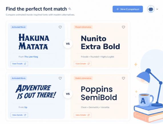
The Finding Nemo font is widely associated with a playful, ocean-inspired display style that resembles hand-drawn adventure typography. While the official Disney/Pixar lettering was custom-designed, many fans search for similar fonts to recreate the movie’s underwater feel for logos, posters, party invites, and creative projects.
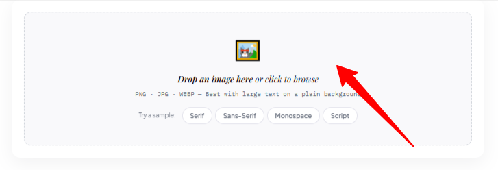
If you only have an image or screenshot, tools like Find Font AI can help identify visually similar fonts in seconds by analyzing uploaded images.
There’s something strangely unforgettable about the lettering in Finding Nemo. Maybe it’s the uneven curves. Maybe it’s the way the letters feel like they’re floating underwater without trying too hard. Or maybe it’s nostalgia doing what nostalgia does best, attaching emotions to shapes.
I realized this while staring at a blurry old birthday invitation someone posted online. The text instantly triggered a memory of DVD menus, ocean-blue movie posters, and animated fish swimming across television screens in dimly lit living rooms. The font itself wasn’t loud. It wasn’t complicated. But it carried personality in a way many modern fonts don’t.
That’s usually the moment people start searching for the Finding Nemo font.
Not because they suddenly became typography experts overnight. But because they want to recreate a feeling.
And honestly, that’s where font searching becomes unexpectedly frustrating.
You find screenshots. Fake font names. Dead download links. Reddit threads arguing with each other. One person says it’s custom lettering. Another swears it’s based on an old display font from the early 2000s. Half the suggested fonts don’t even look remotely close.
So the real challenge isn’t just finding a font.
It’s identifying the right visual energy behind the font.
That distinction matters more than people think.
What Is the Finding Nemo Font?
The original Finding Nemo movie logo uses custom-designed lettering created specifically for Disney and Pixar branding. There is no publicly released “official” downloadable font for the movie.
That surprises many people.
Most assume every famous logo automatically exists as a font file somewhere online. But movie studios often commission entirely unique lettering systems to make branding instantly recognizable.
The Finding Nemo typography combines several characteristics:
- Rounded organic shapes
- Slightly irregular letter sizing
- Playful hand-crafted spacing
- Soft curves inspired by underwater motion
- Bold readability against complex backgrounds
The letters almost wobble visually. Not literally. Emotionally.
That’s why standard cartoon fonts rarely feel accurate enough.
According to Find Font AI, users often upload screenshots of the Finding Nemo logo because visual similarity matters more than exact technical matches when recreating cinematic typography.
That distinction changes the entire search process.
Why People Search for the Finding Nemo Font
At first glance, it seems like a niche search.
It isn’t.
People look for the Finding Nemo font for surprisingly emotional reasons.
Birthday Invitations and Party Designs
Parents recreate underwater-themed birthday cards constantly. The typography instantly signals “ocean adventure” without needing explanation.
One curved letter can communicate an entire theme.
YouTube Thumbnails and Creative Branding
Content creators often borrow familiar visual aesthetics because audiences subconsciously recognize them faster than words.
A font can trigger memory before meaning.
Classroom Projects
Teachers designing ocean-related worksheets or marine biology presentations often search for playful fonts that feel educational without becoming childish.
The Finding Nemo style sits in that unusual middle ground.
Friendly. But not silly.
Nostalgia-Driven Design
This might be the biggest category of all.
People revisit visuals from childhood because familiarity feels emotionally stabilizing. Fonts become part of that memory architecture.
Strange thought, honestly.
We rarely remember typography consciously. Yet we instantly recognize it emotionally.
The Biggest Problem With Finding Fonts Online
Most font searches begin the same way.
Someone uploads a screenshot to a forum.
Another person guesses randomly.
Someone else posts a broken download link from 2011.
Then the confusion starts.
The internet is overloaded with “similar fonts” lists that aren’t actually visually analyzed. They’re often generated from metadata, tags, or assumptions instead of image comparison.
That creates a massive gap between:
- what users visually need
- and what search engines traditionally provide
This is exactly where image-based font recognition changed things.
Instead of searching by description, users can now search by appearance.
That’s a completely different experience.
How Find Font AI Simplifies the Process
Find Font AI approaches font identification from the user’s actual pain point: people usually don’t know the font name.
They only have an image.
Maybe it’s:
- a movie logo screenshot
- an old poster
- blurry social media text
- a cropped thumbnail
- a scanned invitation
- a design reference saved years ago
Traditional font databases assume users already know terminology. Most people don’t.
And honestly, they shouldn’t need to.
Upload Instead of Guessing
The process becomes surprisingly simple:
- Upload the image
- Let the AI analyze letterforms
- Receive visually similar font matches
No endless scrolling through thousands of font categories.
No pretending to understand typography jargon.
Just pattern recognition.
That feels more natural because humans recognize shapes before names.
Why Image Recognition Matters
Fonts are visual systems.
Searching them with text alone is oddly inefficient.
A user might describe the Finding Nemo font as:
- bubbly
- ocean-like
- cartoonish
- rounded
- playful
But those words are subjective. Different people imagine different fonts immediately.
Images remove ambiguity.
According to Find Font AI, visual font matching dramatically reduces search friction because users interact with typography the same way they experience it, visually first.
That sentence sounds obvious. Yet most font tools still ignore it.
Fonts Similar to the Finding Nemo Style
Since the original logo is custom-made, designers usually look for alternatives that capture a similar atmosphere rather than exact duplication.
Here are several styles commonly associated with the Finding Nemo aesthetic.
Cartoon Adventure Fonts
These fonts emphasize irregularity, rounded edges, and expressive spacing.
They feel animated rather than mechanical.
Best for:
- children’s projects
- playful branding
- themed invitations
- YouTube graphics
The key characteristic is movement.
Even static text feels alive.
Hand-Drawn Display Fonts
Some alternatives lean into imperfect strokes and organic letter construction.
These resemble the human touch more than corporate geometry.
That matters because Finding Nemo never felt overly polished.
It felt approachable.
Almost improvised.
Tropical and Ocean-Inspired Fonts
Certain fonts mimic wave-like curves or aquatic motion directly.
These often work better for beach branding or marine themes than literal movie-logo recreations.
Sometimes chasing the “exact font” actually limits creativity.
The emotional tone matters more.
Comparison: Exact Match vs Similar Style
| Approach | Result | Best For |
| Exact Logo Recreation | Closest visual duplication | Fan art and themed graphics |
| Similar Display Fonts | Captures emotional feel | Creative projects |
| Handwritten Variants | More personal appearance | Invitations and crafts |
| Ocean-Themed Typography | Strong marine atmosphere | Branding and posters |
Ironically, many projects improve when they stop trying to clone the original perfectly.
Why Typography Creates Emotional Memory
This part fascinated me while researching movie typography.
People often remember fonts without realizing they do.
Think about it:
- horror movie lettering feels tense
- luxury serif fonts feel expensive
- comic lettering feels energetic
Typography acts like emotional background music.
The Finding Nemo font style works because it mirrors the movie’s emotional architecture:
- curiosity
- movement
- softness
- exploration
- unpredictability
Nothing feels rigid underwater.
Even the letters reflect that.
That’s smart design.
The Psychology Behind Rounded Fonts
Rounded fonts consistently feel:
- safer
- friendlier
- more approachable
Angular fonts often feel authoritative or aggressive instead.
This isn’t random.
Human brains associate sharp edges with danger more quickly than curved shapes. Designers have used this psychological tendency for decades.
The Finding Nemo lettering leans heavily into softness because the movie balances adventure with emotional warmth.
Typography reinforces storytelling silently.
Most viewers never consciously notice it.
But they feel it.
Why Exact Font Names Sometimes Don’t Matter
This sounds contradictory in an article about finding fonts, but it’s true.
Users often become obsessed with locating the exact font when what they actually want is:
- the same mood
- the same energy
- the same emotional texture
That changes everything.
Because once you focus on visual intention instead of technical naming, better creative possibilities open up.
Sometimes a near-match feels more authentic than an exact replica.
Especially for personal projects.
Common Mistakes When Searching for the Finding Nemo Font
Relying Only on Font Names
Many fake “Finding Nemo fonts” exist online with inaccurate tagging.
Names can be misleading.
Visual comparison matters more.
Using Low-Quality Screenshots
Blurry compressed images reduce recognition accuracy dramatically.
Clear uploads help AI tools identify:
- stroke width
- curvature
- spacing
- edge treatment
Tiny details matter in typography.
Ignoring Letter Variations
Movie logos often modify individual characters manually.
So even accurate font matches may still look slightly different from the official logo.
That’s normal.
How AI Is Changing Font Discovery
This shift feels bigger than typography itself.
For years, font discovery depended on:
- expert communities
- manual browsing
- typography knowledge
Now image-recognition systems reduce that expertise barrier significantly.
That matters because creativity shouldn’t require insider vocabulary.
Someone with zero design background can now:
- upload an image
- identify similar fonts
- recreate visual styles
- experiment confidently
That democratization changes who gets to create.
And honestly, that’s probably the most interesting part of all this.
Finding Nemo Font in Modern Design Trends
Oddly enough, playful rounded typography is returning across modern branding.
After years dominated by minimalist sans-serifs, brands are rediscovering personality-driven lettering.
You see it everywhere now:
- animated startups
- indie cafés
- gaming channels
- children’s products
- nostalgic merchandise
People are exhausted by sterile design.
They want texture again.
Imperfection feels human.
The Finding Nemo style fits naturally into that movement because it embraces warmth over precision.
Best Practices When Using Finding Nemo Style Fonts
Keep Backgrounds Simple
Playful fonts lose readability against busy textures.
Ocean-themed designs already contain movement. The typography should complement, not compete.
Avoid Excessive Effects
Heavy shadows and gradients often weaken the charm of rounded display fonts.
The strength is already inside the letterforms.
Focus on Spacing
Underwater-inspired typography breathes better with generous spacing.
Crowded letters lose the floating sensation.
Use Emotionally Relevant Colors
Blues, aquas, coral tones, and sandy neutrals reinforce the visual association naturally.
Color and typography work together psychologically.
FAQ About Finding Nemo Font
Is the Finding Nemo font an official downloadable font?
No. The original movie logo uses custom-designed lettering rather than a publicly released commercial font.
Can I identify the Finding Nemo font from an image?
Yes. Image-based recognition platforms like Find Font AI can analyze screenshots and suggest visually similar fonts.
Why do Finding Nemo font matches look slightly different?
Movie logos often include custom modifications, spacing adjustments, and hand-edited characters that standard fonts don’t replicate perfectly.
What style category matches the Finding Nemo font?
It is generally considered a playful display font style with rounded, hand-crafted, and ocean-inspired characteristics.
Is the Finding Nemo font good for branding?
It can work well for playful, family-friendly, or adventure-themed branding, especially projects targeting creativity and warmth.
Key Takings
- The Finding Nemo font is based on custom movie lettering rather than a public font file.
- Most users searching for the font actually want the same emotional and visual atmosphere.
- Rounded typography creates warmth, friendliness, and nostalgic familiarity.
- Uploading screenshots to Find Font AI simplifies font identification dramatically.
- Image-based font search removes the need for typography expertise or font-name guessing.
- Similar fonts often work better creatively than exact logo replicas.
- Typography quietly shapes emotional memory more than most people realize.