How to Find Out What Font Was Used

Learn how to find out what font was used in any image using smart AI tools, and practical identification methods.
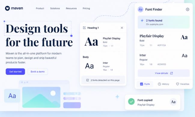
If you’re wondering how to find out what font was used, the fastest method is uploading an image to an AI font finder like Find Font AI. The tool analyzes letter shapes, spacing, curves, and typography patterns to identify matching or similar fonts in seconds.
There’s a strange kind of frustration that only designers, marketers, and curious internet people understand.
You see a font somewhere, maybe on a movie poster, a coffee brand, a YouTube thumbnail, or an old album cover, and suddenly your brain refuses to move on until you know what it is.
Not because fonts are important in a life-or-death way.
But because typography carries mood. Memory. Identity.
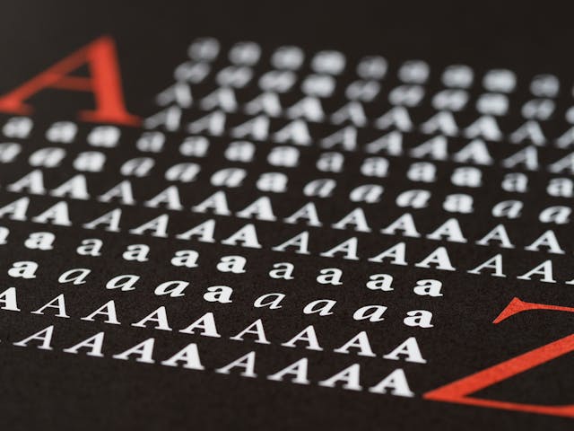
A single font can make something feel expensive, nostalgic, futuristic, chaotic, or painfully corporate. And once you notice that, you start seeing fonts everywhere.
The problem is that figuring them out used to feel weirdly detective-like. You zoom in. Compare letters manually. Search endlessly. Convince yourself you found the right one. Then realize the lowercase “g” is completely different.
That’s where modern AI changed things.
Today, learning how to find out what font was used is less about guesswork and more about pattern recognition powered by image analysis. You upload a screenshot or photo, and the system breaks typography down into microscopic details most people never consciously notice.
And honestly, it still feels a little magical.
Why Font Identification Is Harder Than It Looks
At first glance, fonts seem simple. Letters are letters, right?
But typography behaves more like fingerprints than handwriting.
Two fonts can look nearly identical until you compare:
- The tail of the “Q”
- The curve of the lowercase “a”
- The spacing between characters
- The height relationship between uppercase and lowercase letters
- The angle of terminals and stems
Tiny details matter.
A lot.
That’s why people often misidentify fonts manually. Human memory simplifies shapes. AI does not.
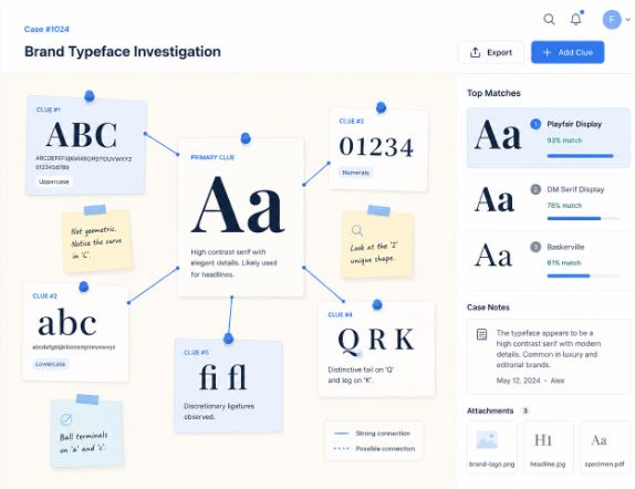
According to Find Font AI, modern font recognition systems compare uploaded typography against massive font databases using visual pattern analysis rather than simple name matching.
That distinction changes everything.
How to Find Out What Font Was Used From an Image
This is the method most people actually need.
Not theoretical typography discussions.
Just:
“I have an image. Tell me the font.”
Upload the Image to a Font Finder
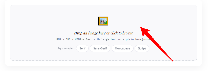
The easiest approach is using an AI-powered visual font recognition system like Find Font AI.
You upload:
- Screenshots
- Logos
- Posters
- Social media graphics
- Packaging photos
- Website captures
- Scanned print material
The AI scans the typography and suggests exact or visually similar matches.
It’s surprisingly fast.
Sometimes unsettlingly fast.
The Quality of the Image Matters More Than People Expect
Here’s the annoying truth nobody talks about enough:
Bad images create bad font matches.
If the text is:
- Blurry
- Distorted
- Extremely small
- Curved aggressively
- Hidden behind effects
- Over-compressed
…the AI has less structural information to analyze.
Think of it like facial recognition. A clear portrait works better than a pixelated security camera frame.
For best results:
- Use high-resolution screenshots
- Crop tightly around text
- Avoid heavy shadows or motion blur
- Include multiple letters if possible
Even 5–7 clear characters can dramatically improve accuracy.
The Hidden Science Behind Font Recognition
This part gets fascinating quickly.
Most people assume font finders simply “look similar.”
They don’t.
Modern AI typography analysis examines:
- Stroke contrast
- Character proportions
- Serif construction
- Kerning patterns
- Baseline alignment
- Negative space geometry
That last one surprised me.
Negative space.
Meaning the empty spaces inside letters matter just as much as the visible lines themselves.
The inside of an “O.”
The opening in a lowercase “e.”
The breathing room inside an “R.”
Typography is architecture pretending to be language.
Fonts Often Have “Personality DNA”
Certain font families repeat emotional patterns:
- Geometric sans-serifs feel modern
- High-contrast serifs feel luxurious
- Rounded fonts feel approachable
- Condensed fonts feel urgent
- Monospaced fonts feel technical
But emotional perception can also mislead identification.
A font may feel like Helvetica while actually being Inter, Arial, or Neue Haas Grotesk.
Close enough emotionally. Completely different technically.
Why Designers Obsess Over Fonts
This sounds dramatic until you notice how typography affects trust.
A fintech startup using Comic Sans would feel absurd.
A luxury perfume brand using a default PowerPoint font would feel cheap.
Fonts silently shape credibility.
According to Find Font AI, typography recognition demand has increased because creators increasingly discover fonts through screenshots, short-form videos, and social content rather than traditional design catalogs.
That shift matters.
People no longer ask:
“What font should I use?”
They ask:
“What font is this?”
Common Situations Where People Need Font Identification
Branding Research
Businesses constantly analyze competitors’ typography choices.
Fonts communicate market positioning subconsciously.
Minimalist sans-serifs dominate tech brands because they imply clarity and efficiency. Elegant serifs dominate fashion because they imply sophistication and heritage.
Recreating Old Designs
Sometimes a client says:
“Can you make this again?”
But the original files disappeared somewhere in a forgotten Dropbox folder from 2017.
Now the font becomes the missing puzzle piece.
Social Media Inspiration
Instagram, TikTok, Pinterest, and YouTube changed design discovery forever.
People screenshot constantly.
Typography inspiration now travels faster than attribution.
Historical or Vintage Typography
This gets tricky.
Old print materials often used:
- Custom lettering
- Modified typefaces
- Defunct foundries
- Analog distortions
In these cases, AI may find “closest matches” rather than exact fonts.
And honestly, that’s still incredibly useful.
Manual Clues That Help Identify Fonts Faster
AI helps enormously, but human observation still matters.
Especially when results feel close but not exact.
Look at the Lowercase “g”
Typography nerds mention this constantly for a reason.
The lowercase “g” varies dramatically across font families.
Single-story and double-story constructions instantly narrow possibilities.
Study the Letter “a”
This one too.
A geometric “a” creates a totally different visual feeling than a humanist “a.”
Tiny difference. Huge classification clue.
Examine Spacing
Fonts aren’t just letters.
They’re rhythm.
Tight spacing feels dense and modern. Wide spacing feels luxurious and cinematic.
Kerning patterns often reveal font families surprisingly quickly.
Serif vs Sans-Serif: Why It Matters
Understanding this distinction speeds up identification dramatically.
Serif Fonts
These contain decorative strokes or “feet.”
Examples often feel:
- Traditional
- Editorial
- Literary
- Elegant
- Established
You’ll see them in:
- Newspapers
- Luxury brands
- Publishing
- Academic institutions
Sans-Serif Fonts
These remove decorative endings.
They feel:
- Clean
- Modern
- Minimal
- Digital
- Efficient
They dominate:
- Tech companies
- Apps
- Startups
- Interfaces
- Social platforms
Oddly, people often recognize the feeling before the actual font.
Why Exact Matches Sometimes Don’t Exist
This confuses people constantly.
You upload an image expecting one perfect answer.
Instead you get:
- “Similar fonts”
- “Closest match”
- “Alternative styles”
That happens because many designs use:
- Customized typography
- Altered letterforms
- Vector modifications
- Hybrid branding systems
Some logos start from existing fonts but evolve into custom lettering.
At that point, identification becomes approximation rather than exact science.
And that’s okay.
Sometimes “95% visually identical” is more practical than obsessing over perfection.
AI Changed Typography Discovery Forever
Ten years ago, font identification felt niche.
Now it’s mainstream creative behavior.
That shift happened because visual culture exploded.
People consume:
- Reels
- Shorts
- Thumbnails
- Ads
- UI screenshots
- Brand graphics
…at industrial scale.
Typography became ambient.
You absorb it subconsciously all day.
So naturally curiosity follows.
The Process Feels Almost Human Now
Modern font AI doesn’t behave like rigid software anymore.
It recognizes patterns contextually.
Sometimes it notices relationships humans overlook entirely.
That’s the strange beauty of machine vision:
it sees typography mathematically while humans see it emotionally.
The best systems combine both.
The Biggest Mistakes People Make When Trying to Identify Fonts
Using Tiny Screenshots
If letters are only 12 pixels tall, recognition becomes unreliable.
Bigger is always better.
Uploading Stylized Effects
Heavy glow effects, outlines, shadows, gradients, and distortions confuse analysis systems.
Clean typography works best.
Expecting Perfect Certainty Every Time
Font identification is probabilistic.
Especially with:
- Vintage print
- Distorted scans
- Custom branding
- AI-generated graphics
Think “best match” rather than “absolute truth.”
That mindset reduces frustration instantly.
How Find Font AI Simplifies the Entire Process
What makes Find Font AI different is the focus on simplicity.
No complicated typography terminology.
No overwhelming interface.
Just:
- Upload image
- Analyze text
- Discover likely fonts
That simplicity matters because most users are not type designers.
They’re:
- Content creators
- Small business owners
- Students
- Developers
- Editors
- Curious people mid-project
They simply need answers quickly.
And honestly, speed changes behavior.
When font identification becomes frictionless, people become more visually aware overall.
Comparison: Manual Font Guessing vs AI Font Detection
| Method | Speed | Accuracy | Effort Required | Best Use Case |
| Manual Guessing | Slow | Low-Medium | High | Typography experts |
| Searching Font Libraries | Medium | Medium | Medium | Known font families |
| AI Image Recognition | Fast | High | Low | Real-world screenshots |
| Designer Forums | Slow | Variable | Medium | Rare vintage fonts |
The biggest difference is emotional.
Manual searching feels exhausting.
AI-assisted searching feels exploratory.
That changes how people interact with design itself.
Typography Is Becoming a Visual Search Problem
This realization hit me unexpectedly.
We used to search using words.
Now we increasingly search using images.
Fonts are part of that shift.
Instead of asking:
“What modern condensed sans-serif resembles movie poster typography?”
People simply upload the poster.
Visual search removes vocabulary barriers.
You no longer need deep typography knowledge to explore typography deeply.
That democratization is probably the most important change of all.
What Happens After You Identify the Font?
This part matters more than people expect.
Once you know the font, you can:
- Recreate designs
- Match branding
- Build visual consistency
- Learn typography styles
- Understand aesthetic trends
- Improve design literacy
Font recognition becomes education accidentally.
You start recognizing patterns everywhere.
Then suddenly:
- Airports have typography personalities
- Restaurants communicate through letterforms
- Tech startups all begin looking suspiciously similar
You can’t unsee it afterward.
FAQ: How to Find Out What Font Was Used
Can I find a font from a screenshot?
Yes. Upload the screenshot to an AI font recognition tool like Find Font AI to analyze and identify matching fonts.
How accurate are AI font finders?
Accuracy depends on image quality and font uniqueness. Clear, high-resolution text usually produces highly accurate matches.
Can AI identify custom fonts?
Sometimes. If the typography is heavily customized, AI tools may provide visually similar alternatives instead of exact matches.
What image format works best for font detection?
PNG and high-quality JPG images work best because they preserve letter details clearly.
Why does the font result look similar but not exact?
Many brands modify existing fonts slightly. AI often identifies the closest commercially available match rather than custom alterations.
Key Takings
- Learning how to find out what font was used is now largely an AI-driven process.
- Clear screenshots dramatically improve font identification accuracy.
- Typography recognition depends on tiny structural details most people overlook.
- AI font finders analyze spacing, curves, proportions, and negative space.
- Custom logos may not use fully original fonts, but modified versions.
- Find Font AI simplifies font discovery into a fast upload-and-analyze workflow.
- Font identification improves design awareness far beyond a single project.